Transit is Here: Mac-Forums Offers Some Observations on the New Apple Maps
I’ll be blunt from the start – I’ve got an odd love/hate relationships for Apple Maps. It’s tightly integrated with Apple’s software offerings and it uses scalable vector graphics which means that it zooms well and uses less data relative to tile based solutions. On the other hand, I’m led astray more often than other options (which themselves do lead me off course once in a while) and, up until now, it has been without any support for transit…until now.
For this brief review/introduction of the new transit functionality, I’m going to use my hometown of Toronto simply because it’s supported and I’m familiar with it which will help in my commentary of its ability to route me effectively. I also live off transit – everywhere I go that I can’t walk to involves me hopping on a subway, streetcar or bus. In that regard, I’ve got some familiarity with the TTC (Toronto’s transit authority) so I feel as though I can offer some sense of insight into the effectiveness of the transit offering.
Caveat: Apple Maps with transit is still in beta and for that reason, I’m not going to comment on stability. I will however comment on utility and functionality but even this requires the implicit asterisk for each comment and critique.
Transit without Routing
It seems odd to start a review of a transit planner without finding a route. That said, sometimes, given familiarity with an area, a route isn’t needed and instead, you simply need a map to show you where the nearest station/stop is and what routes are serviced by that location. In thinking about this, Apple Maps is off to a bad start. As I’ve commented on earlier, AM has a tendency to show transit stops and hide them seemingly at random depending on how you’ve zoomed in or out on the map. Take the following from the downtown business district of Toronto, an area thoroughly covered by not just a collection of streetcars but also the TTC’s main arterial subway, Line 1:
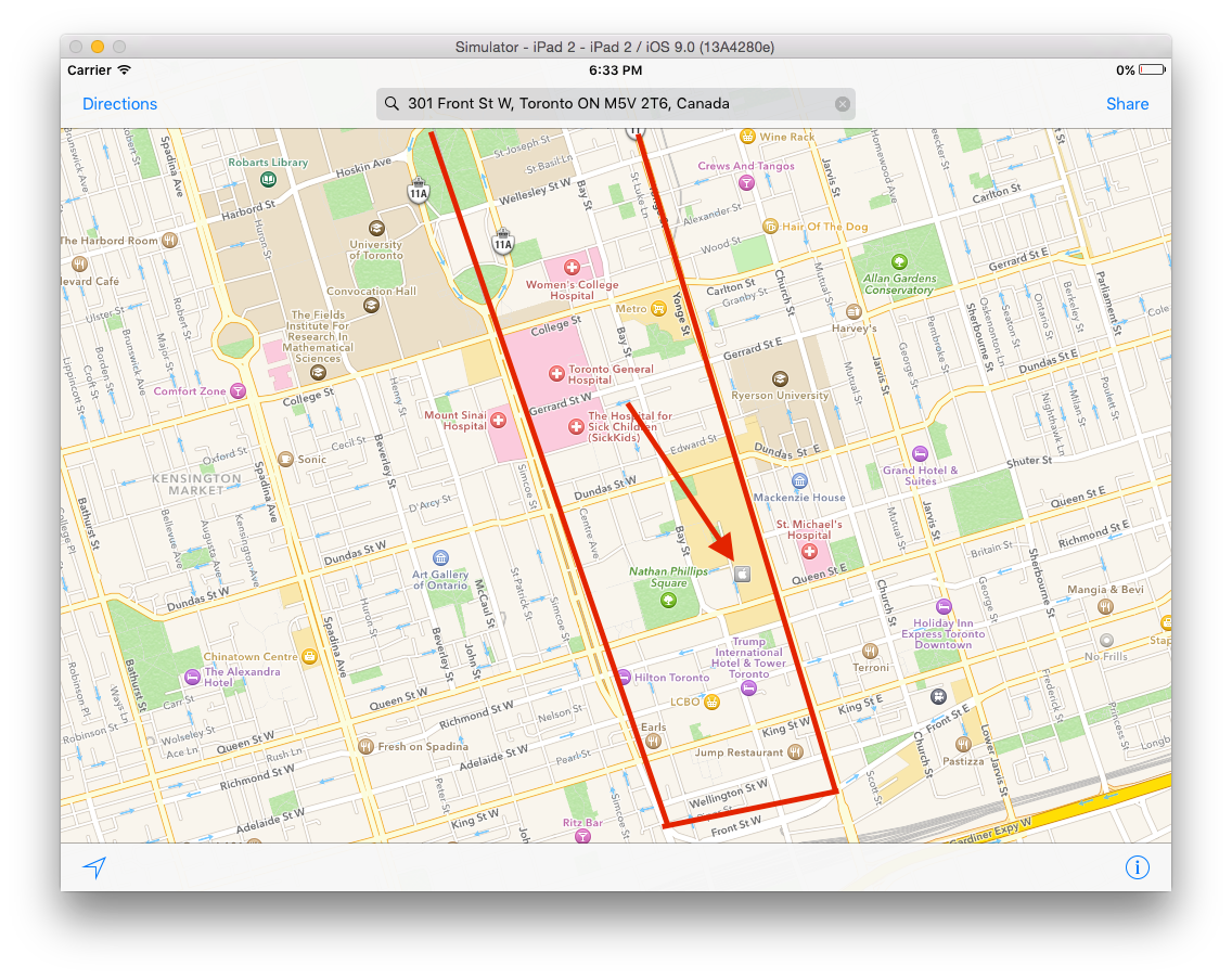
The red line is where Line 1 runs, in a U shaped pattern through the downtown business core. In the space visible to the user here, there should be signaled nine subway stations (maybe ten depending on where AM placed the markers). Given that this is a high volume subway line, the lack of stops or any signification of the line at all except for a faint grey line is inexcusable. That said, most people will be planning a route so this may or may not be such a huge issue for most users (and who knows, Apple may correct this in a future release).
To illustrate the incredulity of this, I offer another example. Take this screenshot of downtown around where Line 2 runs:
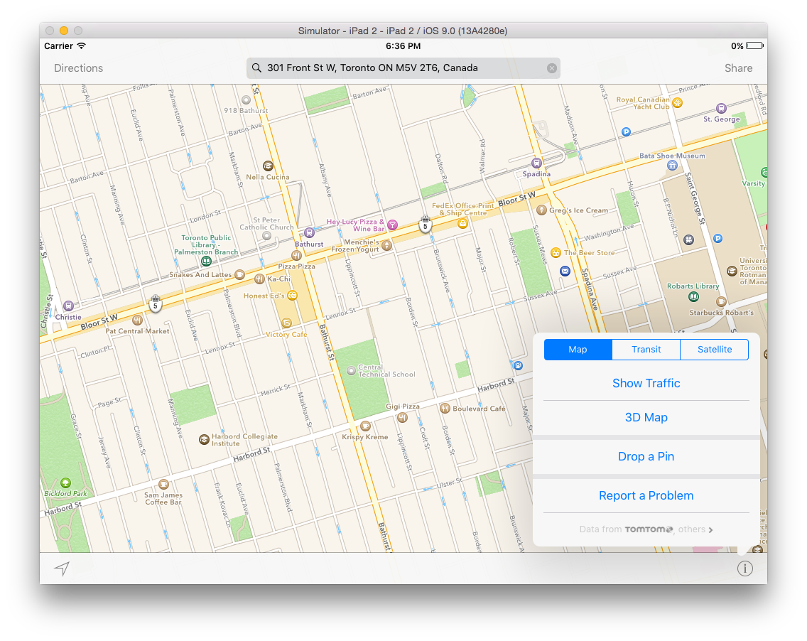
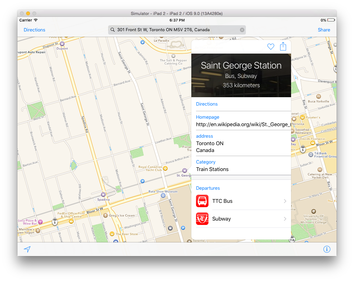
You’ll see, along Bloor St. W, a quartet of subway stations — Christie, Bathurst, Spadina and St. George. You’ll notice in the bottom right that I have the “Map” option selected. If I choose the Transit option, this is what I get:
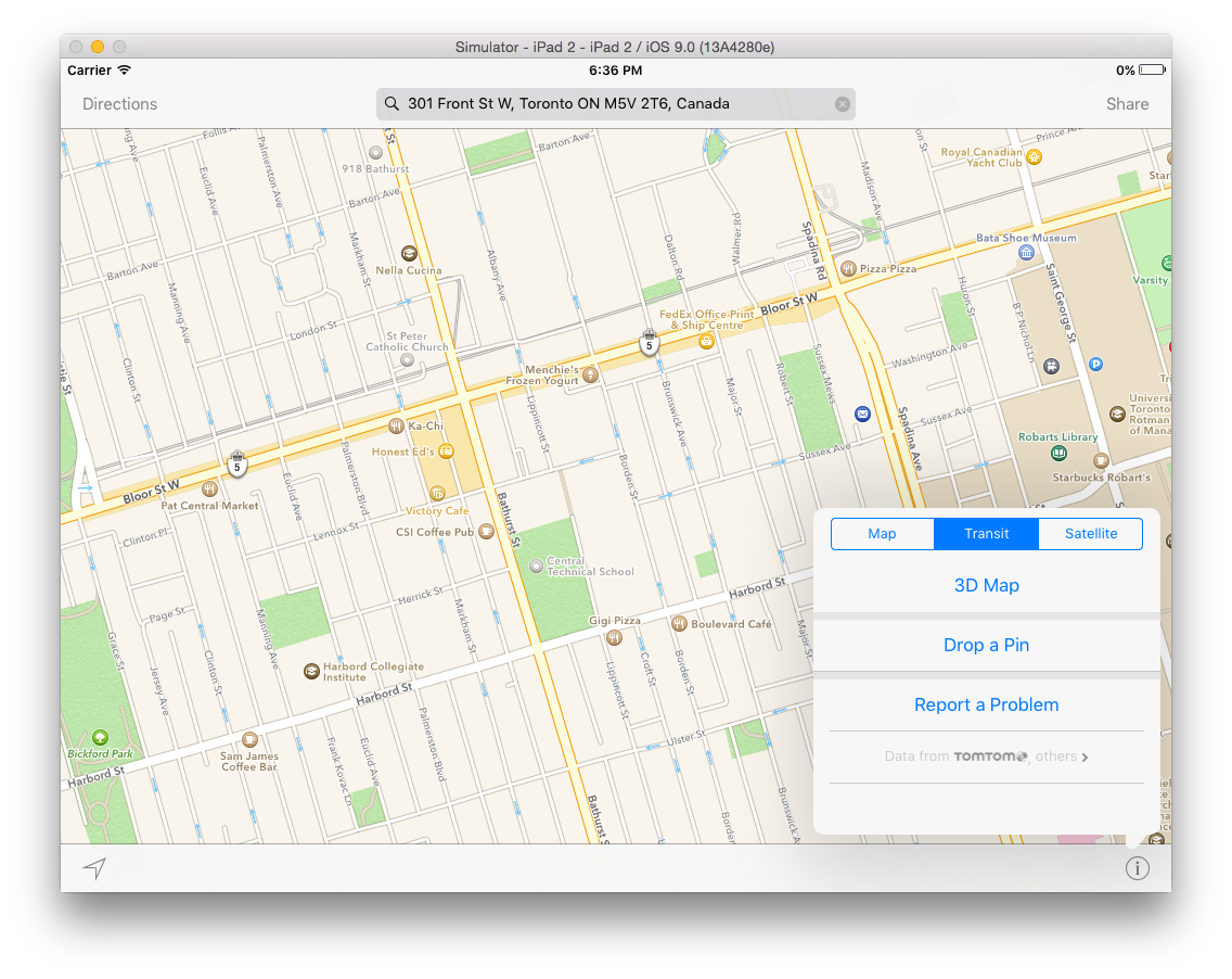
Without making any changes whatsoever other than opting to view the transit map, I am ironically deprived of the subway stations. Why? Your guess is as good as mine.
At this point, you might be thinking that I’m simply using this as a means of critiquing AM once again, adding to the rather long list of critiques that have been levied against AM over the years. This isn’t, however, what I plan to do for routing is done quite well…with some needed revisions.
Routing
The most important part of transit mapping is routing. I’m willing to bet that north of 99% of transit mapping consists of routing (and consequently why the critique I laid out above likely only affects a very small group of people).
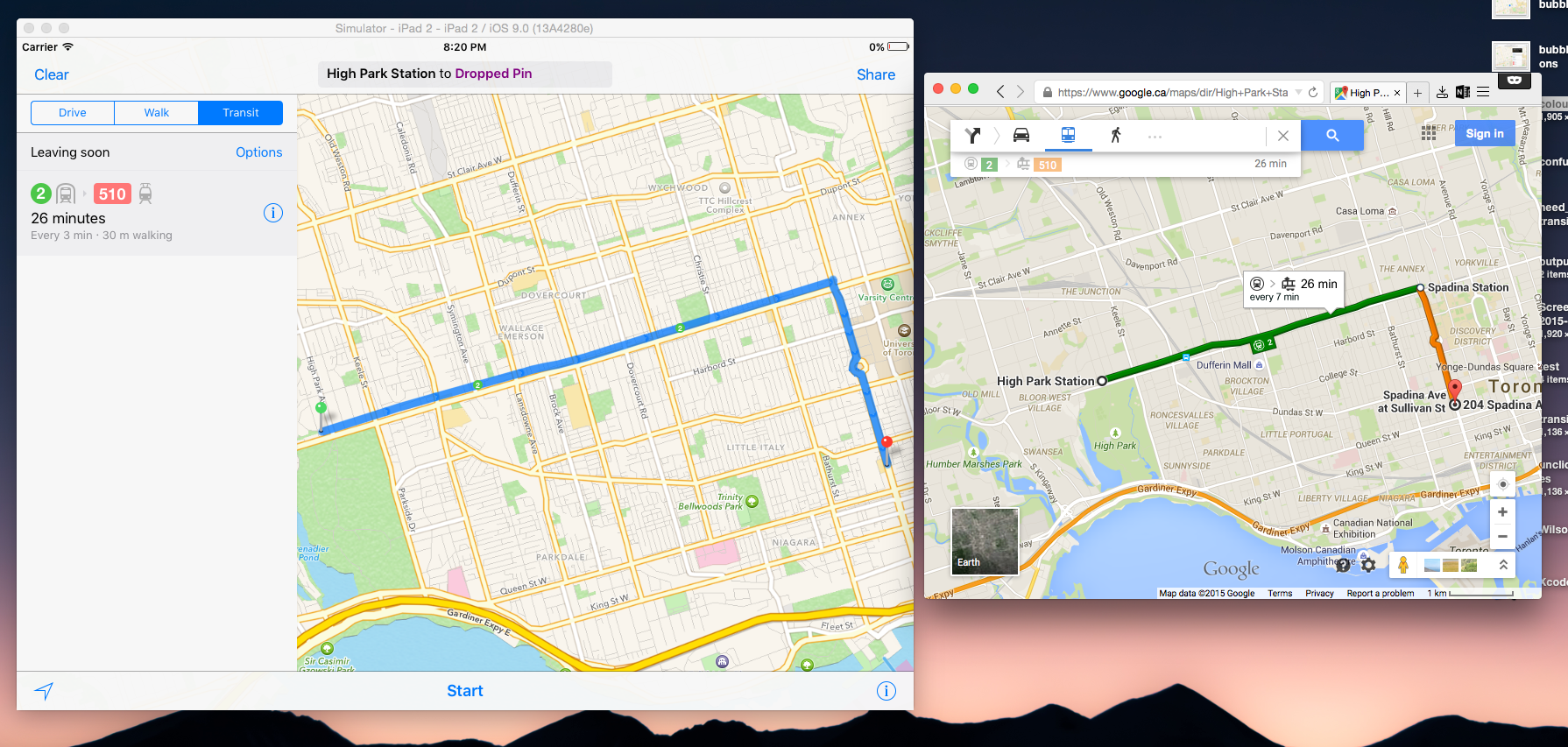
For the sake of illustrating what we’re all in for (and by we, I mean the small collection of us that are going to be serviced by these transit options), I’m going to plan a few fictitious routes around Toronto as the basis for some comments. First, an imaginary trip from High Park (a rather large park just outside of the downtown core) to Chinatown:
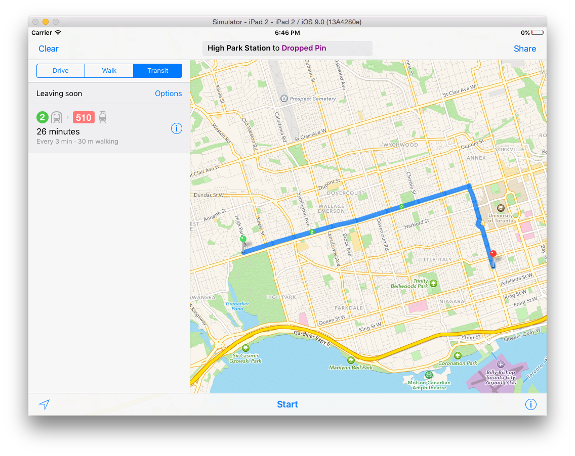 Correctly so, AM chooses the most logical route: take Line 2 east (to the right here from the green marker) to Spadina Ave and then take the 510 streetcar down. This route not only makes the most sense but it was calculated quickly and efficiently. AM, in that regard, has done what it is supposed to. That said, there is one thing that I think needs to be changed. While the transit lines in Toronto for major routes (so, subways and downtown streetcars) are officially numbered and named (often after the streets they run along/under), they are “unofficially” colour coded. While the routes are not referred to by colour, all signage in the city’s system (on buses, streetcars and subways) and on their website use the same colours to signify routes. For example, the four subway lines are coloured yellow (1), green (2), blue (3) and purple (4) with the forthcoming fifth line coloured orange. This, in practice, actually has a lot of value since it makes finding lines very easy on a map and you’re easily able to distinguish lines if you have to transfer. Here’s an example of what I mean:
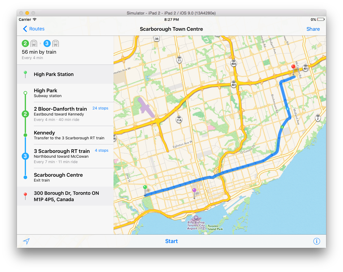
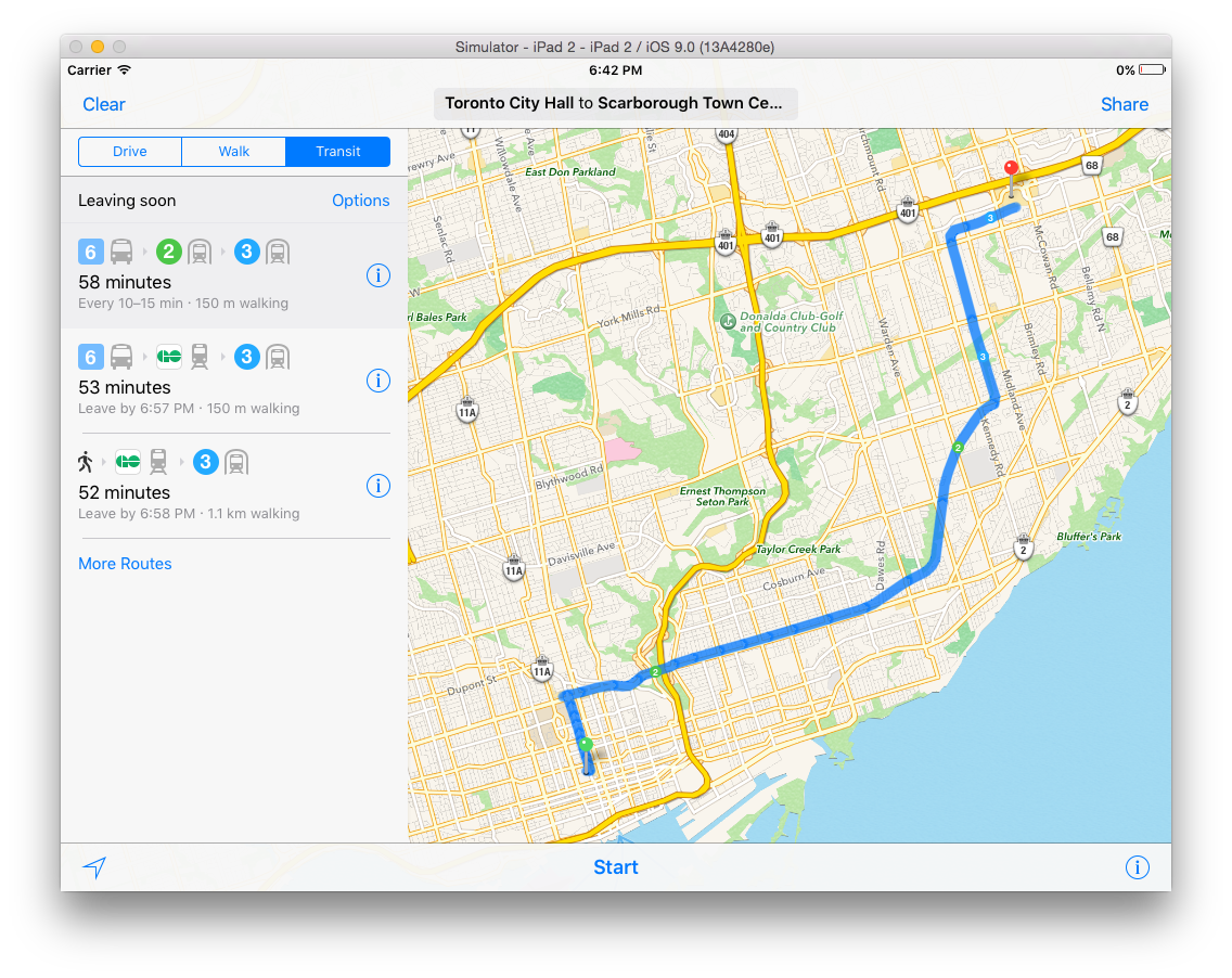
While this may seem like a small difference, the familiarity that comes with seeing coloured route lines matters quite a bit in practice. Those who come from outside of the transit system are also affected by this since routes don’t sometimes have obvious transfer locations (as it does here at the right angle). Take the following as an example, a route from High Park to Scarborough Town Centre, a mall in the east end:
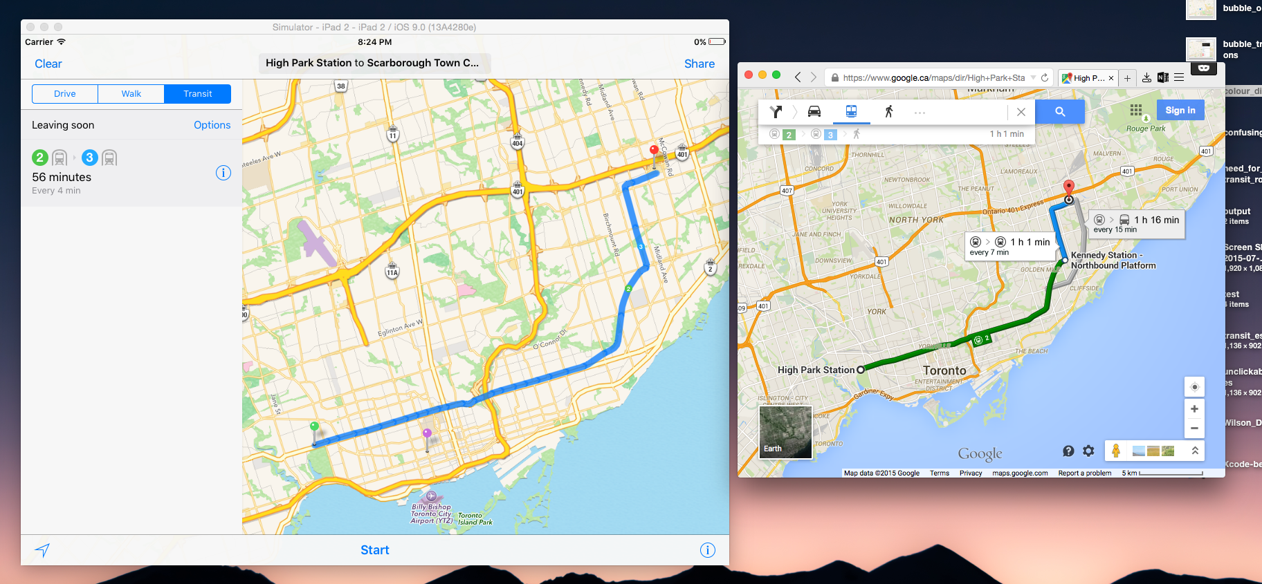
The tricky part here is that the terminus for Line 2 is in the exact same spot as the terminus for Line 3 (I know, it’s ridiculous). In AM, this isn’t all that obvious and indeed, at first glance, it’s not really all that obvious where you change lines. On Google Maps however, the colour coding of lines helps and the distinction itself is augmented by the labeling of the station that serves as the transfer point (Kennedy Station). To be fair to AM though, clicking on the info button does reveal to you the location of the transfer:
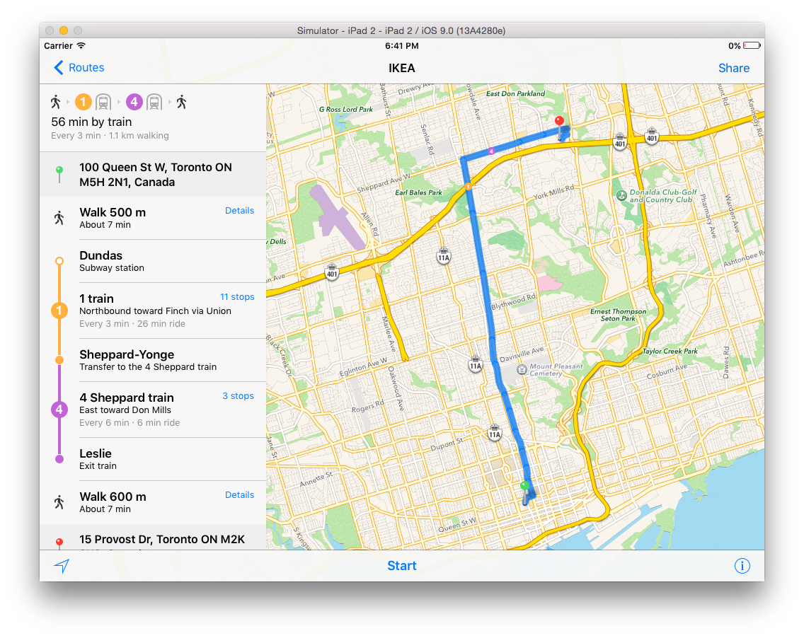
 Here, for the sake of providing more examples, is another example, an imaginary trip from city hall to an Ikea in the north end:
 Aside from the colour coding issues, my limited testing has led me to believe that AM does a decent job of getting you from A to B with little hassle. That said, it does provide interesting options once in a while. Take the following, an imaginary trip from city hall to the aforementioned Scarborough Town Centre Mall:
 The number 6 bus listed here is most certainly an option to take you to Line 2. However, a station on Line 1 is a block away from City Hall and Line 1 intersects with Line 2. Why someone would want to take a bus out of the downtown core over a subway is beyond me.
The Good Stuff
Now, I realize that I said that this review wouldn’t be just a criticism of AM and thus far, I haven’t done a very good job of honouring that promise. Thus, here are a few things that AM does really well.
Right now, I make heavy use of the Transit app. In short, I use it because it taps into the city’s open data about transit and, from this, makes use of the real time data about routes. The Transit app, in using this, is amazingly accurate at telling you when the next streetcar or bus is coming (as far as I can tell, no real time data is provided for subways, which I assume is because they come so regularly that this wouldn’t be of much use). Apple has thankfully also implemented this. Take, for example, a subway station’s info in AM. Clicking it will give you a list of what transit options are available from that location: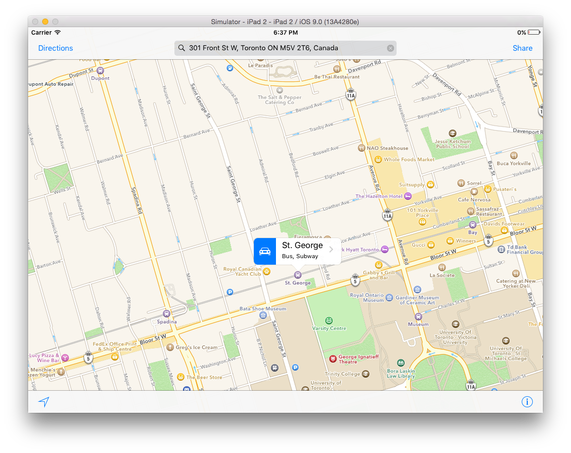 Clicking the bubble gives you a dialog with a list of transit options at the bottom:
 And finally, clicking one of the options gives you details with arrival times:
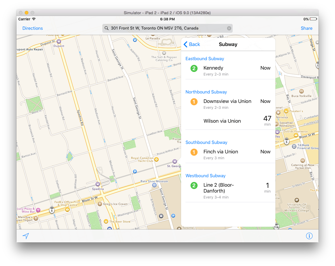 I can’t tell you how valuable this is for transit. One thing that’s curious though is the northbound section for Line 1. There, you’ll see that a northbound train to Downsview (the terminus) is due any minute now. What’s confusing though is the arrival of a train to Wilson in 47 minutes. This is confusing precisely because Wilson station is the stop right before Downsview and AM knows this:
 Wrap Up
Thus far, I’ve only talked about major routes (subways primarily) which should be easy. I plan to take a look at smaller routes, primarily those serviced by buses, to see how well AM can route more complex routes and track the arrival/departure of buses.
If there’s anything you’d like to see, let me know!