You are using an out of date browser. It may not display this or other websites correctly.
You should upgrade or use an alternative browser.
You should upgrade or use an alternative browser.
Welcome to the New Mac-Forums
- Thread starter pigoo3
- Start date

- Joined
- Sep 30, 2007
- Messages
- 9,962
- Reaction score
- 1,235
- Points
- 113
- Location
- The Republic of Neptune
- Your Mac's Specs
- 2019 iMac 27"; 2020 M1 MacBook Air; macOS up-to-date... always.
Thanks for the suggestion. It's something to look at in the future. I believe we have been using that particular logo ever since the forums were organized back in 2003-2004. That was when Macs were still using CRT displays.")
I just noticed that the logo was updated. It's definitely crisper and looks much better in that regard. The second "half" of the logo though I think needs tweaking. The font color was toned down to a light gray and it kinda "dies" against the background, making it harder to read. I'll attach a screen capture for context.

It's more readable if viewed at "full size", but when up in the corner and shrunk down, it's much harder to read. It just fades into the background a bit too much.
- Joined
- Oct 16, 2010
- Messages
- 17,559
- Reaction score
- 1,582
- Points
- 113
- Location
- Brentwood Bay, BC, Canada
- Your Mac's Specs
- 2011 27" iMac, 1TB(partitioned) SSD, 20GB, OS X 10.11.6 El Capitan
It's more readable if viewed at "full size", but when up in the corner and shrunk down, it's much harder to read. It just fades into the background a bit too much.
+1. It just fades into the background waaayyy too much.
And even when viewing the page at a larger size, the light gray "Forums"etc. text just fades away as though it's disappearing into some thick fog. Very hard for some old-timers like myself to read.
- Patrick
=======
- Joined
- Jan 23, 2008
- Messages
- 65,248
- Reaction score
- 1,833
- Points
- 113
- Location
- Keller, Texas
- Your Mac's Specs
- 2017 27" iMac, 10.5" iPad Pro, iPhone 8, iPhone 11, iPhone 12 Mini, Numerous iPods, Monterey
Hey Patrick:
New glasses? LOL
By the way, a good friend of yours showed up the other day in a thread at MacRumors. Yeah, you know who.
New glasses? LOL
By the way, a good friend of yours showed up the other day in a thread at MacRumors. Yeah, you know who.
- Joined
- Jan 23, 2009
- Messages
- 10,320
- Reaction score
- 2,253
- Points
- 113
- Location
- Born Scotland. Worked all over UK. Live in Wales
- Your Mac's Specs
- M2 Max Studio Extra, 32GB memory, 4TB, Sonoma 14.4.1 Apple 5K Retina Studio Monitor
- Joined
- Oct 16, 2010
- Messages
- 17,559
- Reaction score
- 1,582
- Points
- 113
- Location
- Brentwood Bay, BC, Canada
- Your Mac's Specs
- 2011 27" iMac, 1TB(partitioned) SSD, 20GB, OS X 10.11.6 El Capitan
Hey Patrick:
New glasses? LOL
Actually I got some new quite expensive Computer Digital ones last year after an eye exam that I am not very happy with.
I was going to go back to see if they could improve things and then the COVID thing happened, but I shall call them one of these days Now that things seem to be starting to calm down in this area Virus wise.
Actually, they aren't much better than my 3x $20.00cdn COSTCO Reading glasses!!!
I also found an extension for Google Chrome, "High Contrast" that I can enable at times when needed And especially helps with those stupid sites that use light gray fonts on a lite gray background. Stupid design and Apple leads the way on that one!!! Most annoying!!!
- Patrick
=======
- Joined
- Oct 16, 2010
- Messages
- 17,559
- Reaction score
- 1,582
- Points
- 113
- Location
- Brentwood Bay, BC, Canada
- Your Mac's Specs
- 2011 27" iMac, 1TB(partitioned) SSD, 20GB, OS X 10.11.6 El Capitan
By the way, a good friend of yours showed up the other day in a thread at MacRumors. Yeah, you know who.
Ahhhh...!!!
Do I dare say my old nemesis...
And yes he still seems to be BSing his way around it seems.
I must thank the Admins here for their early fine sharp judgment on dealing with that certain individual. Very astute of you all!!!
Thank you. And I am sure that some other members do as well...
- Patrick
=======
- Joined
- Jan 23, 2008
- Messages
- 65,248
- Reaction score
- 1,833
- Points
- 113
- Location
- Keller, Texas
- Your Mac's Specs
- 2017 27" iMac, 10.5" iPad Pro, iPhone 8, iPhone 11, iPhone 12 Mini, Numerous iPods, Monterey
Actually I got some new quite expensive Computer Digital ones last year after an eye exam that I am not very happy with.
Yeah, I know what you mean. After my last eye surgery my ophthalmologist checked my eyes for a new prescription. I wound up buying a new set of glasses at Target who offered a Sr. discount. I probably wore them around 10 times before I gave up. Like you I prefer my drug store readers instead.
After Cataract surgery my eyes returned to 20-20 for distance. It's close up that I need the readers.
- Joined
- Jun 12, 2011
- Messages
- 9,719
- Reaction score
- 1,902
- Points
- 113
- Location
- Melbourne, Australia and Ubud, Bali, Indonesia
- Your Mac's Specs
- 2021 M1 MacBook Pro 14" macOS 14.4.1, Mid 2010MacBook 13" iPhone 13 Pro max, iPad 6, Apple Watch SE.
That's good news Chas, I'm looking at cataract surgery somewhere down the road, just effecting my right eye at the moment. On Tuesday I'm getting a hearing aid for my left ear. The audiologist says I could use one for my right as well but I figure I'll start with one. It will be free because I'm on an Aged Pension now which is just as well because they are $1700.00 to buy.
- Joined
- Oct 16, 2010
- Messages
- 17,559
- Reaction score
- 1,582
- Points
- 113
- Location
- Brentwood Bay, BC, Canada
- Your Mac's Specs
- 2011 27" iMac, 1TB(partitioned) SSD, 20GB, OS X 10.11.6 El Capitan
The audiologist says I could use one for my right as well but I figure I'll start with one.
I have no idea what your hearing graph is like but my audiologist (COSTCO) for my own condition, one ear basically deaf, strongly advised against just using one hearing aid due to technology and one's balance, including hearing balance.
My pair of top-end Resound HAs, NOT rechargeables either thankyou, cost me $2,700.00±/pair cdn without any subsidy or Pension plan support.
Anyway, best of luck whichever way you go... And welcome to the HA world...
- Patrick
=======
- Joined
- Jun 12, 2011
- Messages
- 9,719
- Reaction score
- 1,902
- Points
- 113
- Location
- Melbourne, Australia and Ubud, Bali, Indonesia
- Your Mac's Specs
- 2021 M1 MacBook Pro 14" macOS 14.4.1, Mid 2010MacBook 13" iPhone 13 Pro max, iPad 6, Apple Watch SE.
Thanks for the info Patrick, she is actually getting two in but I said I would probably only opt for one. I will trial both on the day anyway and see what they are like together and separately then make a decision bearing in mind what you say about balance but they are not "in ear" types which I assume yours are so maybe balance will not be an issue.
- Joined
- Oct 16, 2010
- Messages
- 17,559
- Reaction score
- 1,582
- Points
- 113
- Location
- Brentwood Bay, BC, Canada
- Your Mac's Specs
- 2011 27" iMac, 1TB(partitioned) SSD, 20GB, OS X 10.11.6 El Capitan
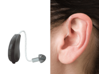
but they are not "in ear" types which I assume yours are so maybe balance will not be an issue.
I do not know what "not "in ear" types" are, but this is what my Receiver-in-Ear (RIE) HAs are like:
- Patrick
=======
Attachments
- Joined
- Jun 12, 2011
- Messages
- 9,719
- Reaction score
- 1,902
- Points
- 113
- Location
- Melbourne, Australia and Ubud, Bali, Indonesia
- Your Mac's Specs
- 2021 M1 MacBook Pro 14" macOS 14.4.1, Mid 2010MacBook 13" iPhone 13 Pro max, iPad 6, Apple Watch SE.
Oh, tha'ts pretty much what mine look like too. I was also offered a set that are like earplugs. Not behind the ear like the ones you picture and that I am getting. They seal the ear completely and she said balance problems can occur when the outer ear is sealed. However they do have another function which is noise reduction. If you turn them off (via iPhone app) you can't hear anything at all. Could be handy sometimes
- Joined
- Jun 12, 2011
- Messages
- 9,719
- Reaction score
- 1,902
- Points
- 113
- Location
- Melbourne, Australia and Ubud, Bali, Indonesia
- Your Mac's Specs
- 2021 M1 MacBook Pro 14" macOS 14.4.1, Mid 2010MacBook 13" iPhone 13 Pro max, iPad 6, Apple Watch SE.
Getting back to topic though this is how the MF logo looks to me. Not too legible.

- Joined
- Jan 23, 2008
- Messages
- 65,248
- Reaction score
- 1,833
- Points
- 113
- Location
- Keller, Texas
- Your Mac's Specs
- 2017 27" iMac, 10.5" iPad Pro, iPhone 8, iPhone 11, iPhone 12 Mini, Numerous iPods, Monterey
The MF Logo looks the same on my screen but a bit brighter with better contrast than what you're showing. I have my 27" iMac adjusted for brightness and contrast to my liking.
I don't see this as a problem. How often are we looking at the logo?
I don't see this as a problem. How often are we looking at the logo?
- Joined
- Sep 30, 2007
- Messages
- 9,962
- Reaction score
- 1,235
- Points
- 113
- Location
- The Republic of Neptune
- Your Mac's Specs
- 2019 iMac 27"; 2020 M1 MacBook Air; macOS up-to-date... always.
The MF Logo looks the same on my screen but a bit brighter with better contrast than what you're showing. I have my 27" iMac adjusted for brightness and contrast to my liking.
I don't see this as a problem. How often are we looking at the logo?
I doubt any regulars are looking at it often. Indeed, it's more of a promotion of the site to new users. But if legibility is going to be shrugged off based on how often anyone looks at it, then why even have the text there?
- Joined
- Oct 16, 2010
- Messages
- 17,559
- Reaction score
- 1,582
- Points
- 113
- Location
- Brentwood Bay, BC, Canada
- Your Mac's Specs
- 2011 27" iMac, 1TB(partitioned) SSD, 20GB, OS X 10.11.6 El Capitan
I don't see this as a problem. How often are we looking at the logo?
In my case, I quite often glance at the logo for the site I'm on.
I wouldn't want to get confused, especially with something similar:


- Patrick
=======
Shop Amazon

We are a participant in the Amazon Services LLC Associates Program, an affiliate program designed to provide a means for us to earn fees by linking to Amazon and affiliated sites.