- Joined
- Nov 18, 2006
- Messages
- 175
- Reaction score
- 2
- Points
- 18
- Location
- Wisconsin
- Your Mac's Specs
- iBook G3|800Mhz|256MB Ram|ComboDrive|30GB HD|

")
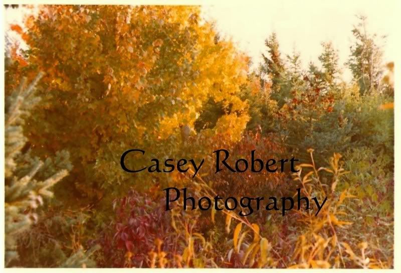
Its going to be an ad on someone elses website, and going to have contact information and a link to me under it. I know I should use a crisp photo but I only have a Film SLR. I think im going to buy some high Definition Kodak film for the next one. Ill try a different font also.It's OK. Still lacking with the typography. Too much leading. Bring it closer together. Also, I'd suggest changing the font again. Script fonts are hard to use, and better suited to wedding invitations and ......well, wedding invitations.
I'd look at using a photo where you have planned a composition for the type at the time of shooting. For example, you might split the photo horizontally in half, with sky in the top half, which is where you'd place the type.
Also, I'd go for a slightly sharper photo. Since it's supposed to advertise your skills, you'd want a nice looking photo, with a crisp focus, displaying technical ability.
I mean no offense, but I don't think this photo does that at the moment. I agree with moss918 - the composition is off.
Some final things to consider. If this is an ad, where will it be? Should it be a banner for a signature, will it be printed, will you also add contact details? At the moment, it's really only text on a photo, so it's hard to know where exactly its place is for an advert.
Hope this is useful, and doesn't come across as too harsh. It's a good start, but I think it hasn't quite reached its potential - keep at it and I'm sure it will though.
__________________
Wow if thats now constructive criticism I guess I just dont know what is. Did it come off harsh? Oh of course not especially when you said it looked like fresh vomit on the floor of a frat party. Really thanks for all the help!I'm still looking for an "ad." All I see is a puddle of orange and yellow vomit with some white script type floating in it.
Seriously. What is this supposed to be? When I see an ad for a photographer, I generally expect to see a beautiful photograph. The photo used here is about as amateur and ugly as it can possibly get. To make matters worse, it appears that you've purposely sucked every ounce of color, depth and contrast out of the photo. It honestly looks like fresh vomit on the floor at a frat party.
Also, I would definitely lose the script font. You won't be able to read it at small sizes, and quite frankly script fonts are horribly "cliche."
A photo that is less busy will get more attention - which I assume is the goal. The photo used here looks like something a 5 year old could have shot with a disposable camera. Focus on YOUR strength as a photographer. If you're into nature shots, go shoot a flower with a macro lens, etc... And make sure it's a yellow/orange/red/purple flower against some nice green grass. Something with contrast.
Sorry if it came across too harsh. I hire photographers all the time in the ad business, so I'm a bit spoiled.

