- Joined
- Apr 4, 2007
- Messages
- 2,641
- Reaction score
- 134
- Points
- 63
- Location
- Durtburg, WV
- Your Mac's Specs
- Sooper Fast!
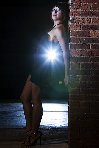
Photos for some models that showed up at a Strobist meet we had in Frederick, Md this afternoon. What's everyone think?
Lighting info and links to the larger sizes can be found by clicking the photos. They go to my Flickr page.
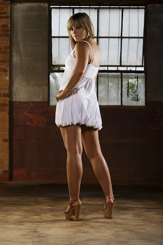
Lighting info and links to the larger sizes can be found by clicking the photos. They go to my Flickr page.

