Site Software Upgrade

pigoo3

Well-known member
Staff member
Admin
Joined
May 20, 2008
Messages
44,213
Reaction score
1,424
Points
113
Location
U.S.
Your Mac's Specs
2017 15" MBP, 16gig ram, 1TB SSD, OS 10.15
We are very pleased to announce the Mac-Forums site software was upgraded today. This is considered a fairly significant upgrade (sort of similar to a macOS upgrade...Catalina to Big Sur for example...or maybe two macOS upgrades).:)

The upgrade includes the usual mix of some new features, improved features, performance improvements, and security updates.

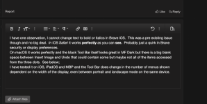
Very likely the the most noticeable change will be the message composition area (the area all of us compose all forum messages). The toolbar/toolbars are laid out a bit differently...and there are some "sub-toolbars" that are accessed via clicking on the three vertical dots button's:

Screen Shot 2021-12-02 at 6.52.27 PM.png

All previous member account settings & preferences should remain the same...and most areas of the site should continue to look & feel the same as it did before.

* If you do see something different...share it with everyone.
* If something new is confusing...please let us know.
* If something does not seem to be working properly...or not working as it did before...please let us know.

Enjoy!:)
 
OP
pigoo3

pigoo3

Well-known member
Staff member
Admin
Joined
May 20, 2008
Messages
44,213
Reaction score
1,424
Points
113
Location
U.S.
Your Mac's Specs
2017 15" MBP, 16gig ram, 1TB SSD, OS 10.15
A bit of additional detail on the changes with the message composition toolbar & buttons. Previously there was a single toolbar...with all function buttons showing all the time.

A potential problem with this is when using a mobile device with a narrow display (like a smartphone)...the single toolbar would wrap-around...and potentially take up a bunch of precious screen real estate. With the updated site software...one of the improvements is the toolbar layout changes depending on the width of the window being used to view the site.

Computer display vs. tablet display vs. phone display...as the window gets more narrow or wider...the layout of the toolbar changes. For example as the window gets more narrow...fewer buttons will be visible at any one time...but more of the 3-vertical-dot buttons will appear...allowing access to more function buttons via a 2nd sub-toolbar.

I believe the goal is for the message composition toolbar to take up as little screen real estate as possible...while at the same time maintaining access to most/all formatting functions/buttons (regardless of what type of device is used).

If you're on a device with a larger display (such as a computer display)...with the message composition/thread reply area visible. Try adjusting the window wider & more narrow...and you will see how the toolbar layout changes depending on the width of the window.:)
 

chscag

Well-known member
Staff member
Admin
Joined
Jan 23, 2008
Messages
65,248
Reaction score
1,833
Points
113
Location
Keller, Texas
Your Mac's Specs
2017 27" iMac, 10.5" iPad Pro, iPhone 8, iPhone 11, iPhone 12 Mini, Numerous iPods, Monterey
If you're on a device with a larger display (such as a computer display)...with the message composition/thread reply area visible. Try adjusting the window wider & more narrow...and you will see how the toolbar layout changes depending on the width of the window.
Doesn't appear to work that way especially on a high resolution display like the 5K iMacs. The message composition window is fixed. The only way it seems to be able to get those extra items for the toolbar is to enact the second and/or the third line by clicking on the three dots.

I don't know if smaller displays such as on a 13" MBA or even the larger 14" and 16" MBP react the same way. Give it a try and let us know what you come up with.
 

Rod


Joined
Jun 12, 2011
Messages
9,700
Reaction score
1,888
Points
113
Location
Melbourne, Australia and Ubud, Bali, Indonesia
Your Mac's Specs
2021 M1 MacBook Pro 14" macOS 14.4.1, Mid 2010MacBook 13" iPhone 13 Pro max, iPad 6, Apple Watch SE.
I have one observation, I cannot change text to bold or italics in Brave iOS. This was a pre existing issue though and no big deal. In iOS Safari it works perfectly as you can see. Probably just a quirk in Brave security or display preferences.
On macOS it works perfectly and the black Tool Bar itself looks great in MF Dark but there is a big blank space between Insert Image and Undo that could contain some but maybe not all of the items accessed from the three dots. See below;
I have tested it on iOS, iPadOS and MBP and the Tool Bar does change in the number of menus shown dependent on the width of the display, even between portrait and landscape mode on the same device.
 

Attachments

  • Screen Shot 2021-12-03 at 11.46.05 am.png
    Screen Shot 2021-12-03 at 11.46.05 am.png
    318.3 KB · Views: 6
Last edited:
OP
pigoo3

pigoo3

Well-known member
Staff member
Admin
Joined
May 20, 2008
Messages
44,213
Reaction score
1,424
Points
113
Location
U.S.
Your Mac's Specs
2017 15" MBP, 16gig ram, 1TB SSD, OS 10.15
Doesn't appear to work that way especially on a high resolution display like the 5K iMacs.
Totally makes sense.

The toolbar layout changes only starts to happen if the window is less than a specified width in pixels. Let's say 900 pixels wide for example. If the window never gets less than 900 pixels wide...then the toolbar changes don't happen.

Since the screen real estate/pixel density on some Apple device displays is very high (4K & 5K iMac's for example)...making the window as narrow as possible still may not be narrow enough to trigger the toolbar to change.

On my non-retina external displays with my desktop Mac Pro...the toolbar layout definitely changes as I make the browser window more & more narrow. On my 15" 2017 MacBook Pro with a retina display...same thing. Toolbar definitely changes as I make the browser window more narrow.

Nick
 
OP
pigoo3

pigoo3

Well-known member
Staff member
Admin
Joined
May 20, 2008
Messages
44,213
Reaction score
1,424
Points
113
Location
U.S.
Your Mac's Specs
2017 15" MBP, 16gig ram, 1TB SSD, OS 10.15
I have one observation, I cannot change text to bold or italics in Brave iOS. This was a pre existing issue though and no big deal. In iOS Safari it works perfectly as you can see. Probably just a quirk in Brave security or display preferences.
Thanks for the info Rod!:)

I know when developers (website developers or software developers)...develop their products they should do testing on as many different browsers as possible. Since this is the best way to confirm compatibility.

But to save time...I'm sure many developers stick to the main most used browsers such as Chrome (~64%) and Safari (~19%)...about 83% of users worldwide. Edge is only about 4%, FireFox 4%, and Opera 2%.

Brave browser only has a 0.05% worldwide market share...thus I'm guessing Brave very possibly may never show up on a developers radar for compatibility testing.:( And as you mentioned...this was an issue with the previous site software version as well.

On the other hand...great to hear things do work properly with iOS Safari.:) I would certainly think iOS Safari would definitely be part of all developers compatibility testing protocols!
On macOS it works perfectly and the black Tool Bar itself looks great in MF Dark but there is a big blank space between Insert Image and Undo that could contain some but maybe not all of the items accessed from the three dots.
I believe this blank space (between the "Insert Image" & "Undo" buttons)...is related to the "pixel width flex" of the window width....until the toolbar layout changes.

In other words...as the browser window is very slowly made more & more narrow...the space between the "Insert Image" & "Undo" buttons slowly gets smaller & smaller...until it gets to the point when the toolbar auto-switches to a different toolbar layout.

With the new site software there are multiple toolbar layouts. Which toolbar layout is used is totally dependent on the width of the browser window in pixels. The goal of this automatic adjusting...is to provide an optimized visitor experience depending on what sort of device a site visitor is using (computer, tablet, or phone).

With the old site software there was only a single toolbar layout (which contained all possible message formatting buttons)...and I think on devices with smaller displays (such as phones)...this single formatting toolbar would take up too much space.

With the new site software...the multiple toolbar layouts (especially on devices with smaller displays)...should allow more space for the actual forum messages folks are composing.:)

HTH,

Nick
 

Shop Amazon


Shop for your Apple, Mac, iPhone and other computer products on Amazon.
We are a participant in the Amazon Services LLC Associates Program, an affiliate program designed to provide a means for us to earn fees by linking to Amazon and affiliated sites.
Top