Is this the future of Apple?

Joined
Nov 20, 2012
Messages
72
Reaction score
0
Points
6
After upgrading to Mavericks I was using the Contacts app, and thought to myself "This is effing ugly!" Black text on a white background. The entire app is a plain, boring, ugly black and white. It looks like something from a Linux desktop 10 years ago! The new iBooks? Black and white. Calendar? Black and white. This black and white insanity is pervasive in iOS 7 as well. Reminders? Black and white. Music? Black and white. Safari? Black and white. Notes? Black and white.

Is it just me or is Apple loosing it? As entrenched as I am in the Apple ecosystem, I have been researching Android phones, and am definitely considering one. I was considering an iPad mini for my 4 1/2 year old (who currently uses my old iPad 1). But instead of adding kid friendly features to the new iPads like the Nexus 7 and Kindle Fire have, Apple increased the price to $400. Well, I plan on getting my kid either the Nexus 7 or Kindle Fire HD for $129, both of which allow you to create a profile for a child and control which apps they have access to, along with other kid friendly features. I plan on taking the money I save and put it in his his college fund.

Apple is loosing it. And since they don't listen to their customers, I plan on making a statement with my dollars.
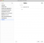
Maverics-Contacts.png
 

pigoo3

Well-known member
Staff member
Admin
Joined
May 20, 2008
Messages
44,212
Reaction score
1,424
Points
113
Location
U.S.
Your Mac's Specs
2017 15" MBP, 16gig ram, 1TB SSD, OS 10.15
After upgrading to Mavericks I was using the Contacts app, and thought to myself "This is effing ugly!"

Apple is loosing it. And since they don't listen to their customers, I plan on making a statement with my dollars.

Nothing in this world is ever approved by 100% of the population (users) using the product. Just the way it is...nothing is perfect.

In fact...you only mentioned one very small aspect of Mavericks (Contacts app.). There have got to be multiple new things or refinements that you do approve of...aren't there??:)

If not...and you 100% hate everything Mavericks stands for...you of course are perfectly entitled to that opinion. But I think that you will clearly be in minority with that.

- Nick

p.s. Remember...Mavericks was free. It's not like you paid good money for it...and are disappointed.
 

bobtomay

,
Retired Staff
Joined
Dec 22, 2006
Messages
26,561
Reaction score
677
Points
113
Location
Texas, where else?
Your Mac's Specs
15" MBP '06 2.33 C2D 4GB 10.7; 13" MBA '14 1.8 i7 8GB 10.11; 21" iMac '13 2.9 i5 8GB 10.11; 6S
I agree.

What about when they removed the doubletap on the top bar to minimize iTunes back in 10.7. Why?
We're up to 10.9 now and we still have to hit the tiny minimize button. Why?
The only app in OS X that can't be minimized from the top bar.

Changed the sidebar icons to gray instead of color in both iTunes and Finder... Why?
I have add-ins to change them both back to color, so I can't tell if 10.9 changed those back or my add-ins are still functioning.

Change iOS app icons from a 3D look with gradient backgrounds to plain jane mid 1990s Linux 2D with single color backgrounds.

They have a few reviewers complaining about skeumophism in their apps.
So, instead of coming up with something better, they just change them all to black text on white background.
That'll show those reviewers.
 

dtravis7


Retired Staff
Joined
Jan 4, 2005
Messages
30,133
Reaction score
703
Points
113
Location
Modesto, Ca.
Your Mac's Specs
MacMini M-1 MacOS Monterey, iMac 2010 27"Quad I7 , MBPLate2011, iPad Pro10.5", iPhoneSE
I have to say I do agree with all Bobtomays points above.
 
Joined
Feb 14, 2004
Messages
4,781
Reaction score
166
Points
63
Location
Groves, Texas
Had to look that word up...
Didn't care for the fake book contacts or calendar either. Then again, there's simple and there's "Oh man, is that the best you can do?".
 
Joined
Nov 9, 2011
Messages
252
Reaction score
7
Points
18
Your Mac's Specs
15" rMBP Mid-2014 ~ iPad 4 16GB ~ iPhone 6 Plus 16GB
Not to be contrary again :Blushing: but I quite like the new interfaces. But that's why we're individuals!

Removing handy functions is a silly thing to do though...
 
Joined
Nov 28, 2007
Messages
25,564
Reaction score
486
Points
83
Location
Blue Mountains NSW Australia
Your Mac's Specs
Silver M1 iMac 512/16/8/8 macOS 11.6
Matter of moving with the times.

Older (or more experienced maybe?) forum members can recall the stink that was created with the original iMac removing the floppy drive. Apple committed marketing suicide we were told. Happens when you are at the fore of technology.
 

dtravis7


Retired Staff
Joined
Jan 4, 2005
Messages
30,133
Reaction score
703
Points
113
Location
Modesto, Ca.
Your Mac's Specs
MacMini M-1 MacOS Monterey, iMac 2010 27"Quad I7 , MBPLate2011, iPad Pro10.5", iPhoneSE
The Floppy I was very much for them removing. So many floppy 3.5" discs dying. Was that way for everyone I knew.

I was at Frys in the Silicon Valley (Sunnyvale I believe) the weekend that Bondi Blue iMac was released. People were running around like it was the end of the world like chicken little and the sky is falling. NO FLOPPY! My god what are we going to do now? My friend and I were not really shocked at all. I stopped using floppies way back and bought one of the first Iomega Zip drives, so I knew it was coming. After the Flash drive came out, I did in NO WAY miss the floppy.

An Optical drive I still do use here for my work and fun. Blank DVD's are so cheap. That I miss a lot more but with a desktop system, a USB drive works wonders. I am though more concerned with a notebook as I really don't like dragging stuff along with me besides the notebook.

An example. Doing a video for say friends or Family and giving each person their copy. With a quality video a Flash drive would be $10+ per person where Blank DVD's would be pennies a DVD.
 

vansmith

Senior Member
Joined
Oct 19, 2008
Messages
19,924
Reaction score
559
Points
113
Location
Queensland
Your Mac's Specs
Mini (2014, 2018, 2020), MBA (2020), iPad Pro (2018), iPhone 13 Pro Max, Watch (S6)
It looks like something from a Linux desktop 10 years ago!
Linux was deeply grey and was awash in muted colours. If anything, Apple's new "black on white" style is nothing like it. ;)

But instead of adding kid friendly features to the new iPads like the Nexus 7 and Kindle Fire have, Apple increased the price to $400. Well, I plan on getting my kid either the Nexus 7 or Kindle Fire HD for $129, both of which allow you to create a profile for a child and control which apps they have access to, along with other kid friendly features.
For almost twice the price, you'd think the Mini would be twice the tablet which isn't even close to reality. It might be a nice 7" tablet but against the solid hardware of the Nexus 7, Apple's got to do a lot more (a lot...a lot) to justify the price tag. While I think the iPad Mini is probably a nice device, the marketing team is delusional to think that $400 is acceptable.

Apple is loosing it. And since they don't listen to their customers, I plan on making a statement with my dollars.
They might be "losing it" but it's working for them.
 

dtravis7


Retired Staff
Joined
Jan 4, 2005
Messages
30,133
Reaction score
703
Points
113
Location
Modesto, Ca.
Your Mac's Specs
MacMini M-1 MacOS Monterey, iMac 2010 27"Quad I7 , MBPLate2011, iPad Pro10.5", iPhoneSE
Agreed with Van, does not look like any Linux I have seen and I have been working with Linux since 1992.
 
OP
Z
Joined
Nov 20, 2012
Messages
72
Reaction score
0
Points
6
Nothing in this world is ever approved by 100% of the population (users) using the product. Just the way it is...nothing is perfect.

In fact...you only mentioned one very small aspect of Mavericks (Contacts app.). There have got to be multiple new things or refinements that you do approve of...aren't there??:)

If not...and you 100% hate everything Mavericks stands for...you of course are perfectly entitled to that opinion. But I think that you will clearly be in minority with that.

- Nick

p.s. Remember...Mavericks was free. It's not like you paid good money for it...and are disappointed.


No, I did not only mention one small aspect of Mavericks. I mentioned the Contacts app, the calendar, Reminders, Music. All of these are an ugly black and white. That goes double for the iOS 7 versions of these apps. In addition to being ugly, all white applications are a strain on the eyes. Apple is loosing it's ability to create an esthetically pleasing graphical interface to an obsession with minimalism.
 

vansmith

Senior Member
Joined
Oct 19, 2008
Messages
19,924
Reaction score
559
Points
113
Location
Queensland
Your Mac's Specs
Mini (2014, 2018, 2020), MBA (2020), iPad Pro (2018), iPhone 13 Pro Max, Watch (S6)
Music? You mean iTunes? That looks as it has for a long time. And, from the looks of it, Reminders looks the same (don't use it myself but it looks pretty much the same).
 
OP
Z
Joined
Nov 20, 2012
Messages
72
Reaction score
0
Points
6
Agreed with Van, does not look like any Linux I have seen and I have been messing with Linux since 1992.


I've been doing linux (and unix) systems administration since the mid 90's. I've done a lot more than "messed with linux". You must not been exposed to the many different versions of linux as I have. I've used Redhat since 5.0, Fedora, Ubuntu, SUSE, running assorted window managers, and I currently administer over 40 CentOS bare metal and virtual machines in an enterprise environment.

Let me rephrase my original comment -- Many of the new Apple core applications are not nearly as esthetically pleasing as those of some linux distributions I've used. Apple seems to have forfeited the idea of eye candy for an obsession with minimalism.
 

dtravis7


Retired Staff
Joined
Jan 4, 2005
Messages
30,133
Reaction score
703
Points
113
Location
Modesto, Ca.
Your Mac's Specs
MacMini M-1 MacOS Monterey, iMac 2010 27"Quad I7 , MBPLate2011, iPad Pro10.5", iPhoneSE
ITunes has looked this way for a while now. It's not just a Maverick thing. I stopped liking the looks back when 11.0 came out and they did away with Cover flow.

I dont' particularly like the look of the new Contacts and the calender don't look the best to me.

And you really do not know my experience with Linux either so please do not go there.

And you stated IOS7 looked like a 10 year old Linux. You did not say many of the apps. So anyway, I agree in some ways with your comments about looks of some apps, just not the Linux part.

I also edited my post and changed MESSING with Working. I did not feel I had to state exactly what I did with it.
 

vansmith

Senior Member
Joined
Oct 19, 2008
Messages
19,924
Reaction score
559
Points
113
Location
Queensland
Your Mac's Specs
Mini (2014, 2018, 2020), MBA (2020), iPad Pro (2018), iPhone 13 Pro Max, Watch (S6)
I've been doing linux (and unix) systems administration since the mid 90's. I've done a lot more than "messed with linux". You must not been exposed to the many different versions of linux as I have.
Knowing dtravis7, I can say that you're probably right but would also say that we, between the two of us, have seen quite a bit of Linux.

Let me rephrase my original comment -- Many of the new Apple core applications are not nearly as esthetically pleasing as those of some linux distributions I've used. Apple seems to have forfeited the idea of eye candy for an obsession with minimalism.
Those are all very subjective comments. Many people, myself included, absolutely love this minimalist trend amongst the large software and hardware companies. It's, plain and simple, fantastic. As for Linux, the overuse of graphics acceleration in Des (KDE, GNOME, MATE, Unity, etc.) creates unnecessary flash.
 

dtravis7


Retired Staff
Joined
Jan 4, 2005
Messages
30,133
Reaction score
703
Points
113
Location
Modesto, Ca.
Your Mac's Specs
MacMini M-1 MacOS Monterey, iMac 2010 27"Quad I7 , MBPLate2011, iPad Pro10.5", iPhoneSE
Van and I are on the same page with iTunes. It's been this way for many versions now.

I have worked with every Linux that was available
to me which is every one you have mentioned. This will really upset some of the Apple Faithful, but I find some of the 10 year old Linux distros better looking than some of the apps in IOS7! :D Grin


BUT as Van said, it's a personal thing but some of the colors in some apps on IOS7 are not getting along well with people with bad vision. People are having issues reading the text. That part right there bothers me. Give us a way to change it if it causes issues for our eyes.
 
OP
Z
Joined
Nov 20, 2012
Messages
72
Reaction score
0
Points
6
ITunes has looked this way for a while now. It's not just a Maverick thing. I stopped liking the looks back when 11.0 came out and they did away with Cover flow.

I dont' particularly like the look of the new Contacts and the calender don't look the best to me.

And you really do not know my experience with Linux either so please do not go there.

And you stated IOS7 looked like a 10 year old Linux. You did not say many of the apps. So anyway, I agree in some ways with your comments about looks of some apps, just not the Linux part.

I also edited my post and changed MESSING with Working. I did not feel I had to state exactly what I did with it.


Ah, you work with linux. Well that's a horse of a different color! And yes, the core iOS 7 apps like Reminders, Calendar, Music, etc., are black and white. I hate black and white apps! And the fonts which cannot be changed like in the menu bar, and on the buttons, are ridiculously small and hard to read. I've spoken to many iPhone owners who wear glasses who say the same thing. I used to love iOS 6 and how elegant it looked. Now I look at these new iOS 7 apps and think to myself that Jony Ive should be fired. They just took the minimalist idea to extremes.
 

dtravis7


Retired Staff
Joined
Jan 4, 2005
Messages
30,133
Reaction score
703
Points
113
Location
Modesto, Ca.
Your Mac's Specs
MacMini M-1 MacOS Monterey, iMac 2010 27"Quad I7 , MBPLate2011, iPad Pro10.5", iPhoneSE
I have heard and seen pics and some of the apps are Gray and white which is VERY hard to read for many people out there.
 
Joined
Nov 9, 2011
Messages
252
Reaction score
7
Points
18
Your Mac's Specs
15" rMBP Mid-2014 ~ iPad 4 16GB ~ iPhone 6 Plus 16GB
and think to myself that Jony Ive should be fired.

Slowly now, would you like to see Apple turn into one the the other ordinary companies out there? Jony Ive's designs are ground-breaking and is a good reason why Apple has a huge lead in certain aspects. Other companies blatantly copy Apple in an attempt to get close to the "sexiness" he has produced.
 

vansmith

Senior Member
Joined
Oct 19, 2008
Messages
19,924
Reaction score
559
Points
113
Location
Queensland
Your Mac's Specs
Mini (2014, 2018, 2020), MBA (2020), iPad Pro (2018), iPhone 13 Pro Max, Watch (S6)
Slowly now, would you like to see Apple turn into one the the other ordinary companies out there? Jony Ive's designs are ground-breaking and is a good reason why Apple has a huge lead in certain aspects. Other companies blatantly copy Apple in an attempt to get close to the "sexiness" he has produced.
That's a bit of a stretch since, if Apple is pushing to move to minimalist designs in their software, they are taking a page from Google's book. It's also important to see how design is a two-way street - Apple serves as inspiration for others just as much as others serve as inspiration for Apple.
 

Shop Amazon


Shop for your Apple, Mac, iPhone and other computer products on Amazon.
We are a participant in the Amazon Services LLC Associates Program, an affiliate program designed to provide a means for us to earn fees by linking to Amazon and affiliated sites.
Top