Photography Book

Joined
Apr 21, 2007
Messages
1,174
Reaction score
23
Points
38
Location
Sydney, Australia
Your Mac's Specs
13" MBP, 2.26GHz, 8gb RAM
I'm making a photography book, similar to The Blue Day Book by Bradley Grieve. Different theme, but same style. If you don't know what it is, visit this link: http://www.amazon.com/Blue-Book-Brad.../dp/0740704818?tag=macforums0e4-20 and go to Search Inside, read the first 5 or 6 pages with photos on it and you'll get the idea. It's about a sentence per page, so it won't take long.

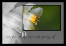
This is an example of one of the pages that will be in the book - If the page is a left hand side page, it'll be like this, if it is right, it'll be the opposite - image aligned to the right and text to the left. I'm thinking of swapping that around though, so the photo is easier to see. Apart from that, what else is there that I can do to this to make it look... better? It looks a tad tacky at the moment and would like to improve it.
page.jpg
 
Joined
Oct 26, 2006
Messages
167
Reaction score
1
Points
18
Location
California
Your Mac's Specs
15" Macbook Pro, 2 GBs Ram, 250gb My Book, 500gb Lacie,40gb 3rd Gen ipod,60gb ipod video
Personally I think your images would stand out a lot better without the black borders. I find that black borders just seem a bit cliched to me and overdone online. I think having a border gives the eye an additional thing to look at, which will take away the strength of an image and also diminish the effect of contrast within the picture. I know when I first started out in photography I started putting black borders on my images and I thought to myself "something's not right", I took away the borders and I've been borderless since, haven't looked back. Hope that's what you're looking for.
 
OP
Leukeh
Joined
Apr 21, 2007
Messages
1,174
Reaction score
23
Points
38
Location
Sydney, Australia
Your Mac's Specs
13" MBP, 2.26GHz, 8gb RAM
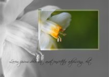
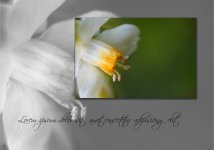
I've taken off the black borders - I think you're right, they are quite generic. I added a different border to the smaller image, which I think looks quite nice. I've uploaded both so you can see what they look like. The borderless one, to me, looks like it's missing something.

example page2.jpg

example page2a.jpg
 
Joined
Jun 21, 2007
Messages
26
Reaction score
0
Points
1
Location
Richmond, VA, a native of Chapel Hill, N.C.
Your Mac's Specs
17' iMac Core 2 Duo 2.16 1g ram | iPod Photo 60gb | 2G Shuffle
I agree that the borderless one looks like it's missing something, but I don't like how the border confuses the line between the congruent image. Perhaps a drop shadow . . ?
 
OP
Leukeh
Joined
Apr 21, 2007
Messages
1,174
Reaction score
23
Points
38
Location
Sydney, Australia
Your Mac's Specs
13" MBP, 2.26GHz, 8gb RAM
Good idea! I'll do that now...

There we go!

example page3.jpg
 
Joined
Oct 7, 2005
Messages
346
Reaction score
14
Points
18
Location
Seattle
Your Mac's Specs
MBP CD 1.83/2ghz/7200 100g + Mini 2ghz C2D 2gb + Mini 1.42ghz G4 + PM 7200/120 + Newton OMP
I was going to suggest a thin, white border (which would not detract because of the colour of the flower), but I think the drop shadow does look great, doesn't detract, and gives the visual separation you're probably looking for.

Nice :)
 

Shop Amazon


Shop for your Apple, Mac, iPhone and other computer products on Amazon.
We are a participant in the Amazon Services LLC Associates Program, an affiliate program designed to provide a means for us to earn fees by linking to Amazon and affiliated sites.
Top