On the difficulty of text placement

M

MacHeadCase

Guest
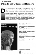
At school, we are now into learning how to create a grid to help us construct well balanced ads and pages.

It's funny how part intuition, part analysis come into play with text placement. You have to develop a sensitivity to typefaces, the weight of the grey they create as opposed to the white of blank spaces, choosing the right type for what you want the ad to say. You can also choose the type for the space limitation you have, etc.

What works and what doesn't? That's what we are trying to learn. At first, I would have dismissed it as artsy fartsy stuff but I am more and more getting into this type of thing. I really like the thought process behind all this.

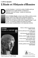
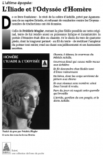
The first screenshot is the grid I am using, the second is the first version of the ad, the third is the latest version of the ad. In the last version, I cheated a little and didn't completely respect the grid I created because I felt there was a lack of balance in the ad.

Grid.png

First_version.png

Latest_version.png
 
Joined
Jan 14, 2005
Messages
2,078
Reaction score
155
Points
63
Hmm... let me make some first impression remarks:

1) Too many typefaces. The eye is getting confused and doesn't know what to read.

2) The publisher's logo feels liek it's fallen out of the rest. It's better in version 1, or just move it further up or down in version two. It's kind of overlapping now.

3) The D and e of "De" are to far away. The D is too big, and the gradient bar under it seems cluttering. Try placing the D inline with the paragraph.

Just some critical thoughts, otherwise it's quite good.
 
OP
M

MacHeadCase

Guest
Well the hierarchy I saw was that the publisher's logo is seen twice: on the book cover and somewhere in the ad. The repetition, I thought, gave me the liberty to put the logo in the text smaller.

For the ad, I used only two typeface families, Égyptienne (Roman) and Avenir (Roman Oblique). Égyptienne because of the serif, brings a feeling of "ancient" or a notion of history with it. Avenir brings in a feeling of "contemporary" ( -> modern translation).

For the gradient bar, it was just an experiment. I had first tried out a grey 6pt line but thought it didn't give a big enough punch.

I will keep on trying things, see where your suggestions might take me, yogi. Thanks for the constructive comments.

We are slowly getting into the "Swiss school" grid for text placement, btw.
 
Joined
Feb 2, 2004
Messages
12,455
Reaction score
604
Points
113
Location
PA
Your Mac's Specs
MacBook
Well your latest version definitely clears up the issue with the orphan in the second paragraph. Also, the ragged-right is better than the original justified type. Justified type really only belongs in newspapers, and that is about it.

As for the drop-cap, did you use the same font face for both versions? It looks like you bastar.dized (yes, this is an actualy industry term, kids :black: ) the font a bit, you should really try to avoid that if you did.

The logo placement in the copy does seem a little better in the first version, its okay to have a little white space in the right column.

It is a very good use of a grid, though.
icon14.gif
 
OP
M

MacHeadCase

Guest
Thanks DB!

Yeah I wasn't working on the orphan lines at that point. I was more concentrated on simple text placement first, then tweaks would be done later once I was satisfied with the general look of the text.

And about the drop cap, yes I did scale it.

Here is my latest version of the ad... Got rid of the scaled drop cap and kept the type as the font made it.

Ad_latest.png
 
Joined
Aug 2, 2006
Messages
1,454
Reaction score
66
Points
48
Location
Suffolk, UK
Your Mac's Specs
MBP - 2.66Ghz Core 2 duo, 4GB Ram, 320GB HDD, Geforce 9400m + 9600M GT (256mb)
Reminds me of the same sort of techniques required in composition for photography using a grid to help. (Rule of thirds)

Good work with the ad MHC :)

~~ TS ~~
 
Joined
Dec 4, 2006
Messages
92
Reaction score
1
Points
8
Location
Chattanooga, TN
Your Mac's Specs
MBP 2.33GHz Intel C2D 2GB 667MHz DDR2 SDRAM 120GB SATA 2GB SDRAM
Seriously... what's the point of that gradation? I think it's just visual noise and doesn't do anything for the ad.

Also... right justifying the copy associated with the photo isn't a good move. You've disassociated that information with the image. In addition, it seems as though you're putting more leading at weird places in that copy. I can't read it b/c I don't know the language, but it seems you have awkward line spacing in your sentences. Visually, it doesn't make sense.

Bring the heading close to the body copy and increase the leading some. Let your copy breathe. It's heavy. Let some air get between your lines there. It'll add to your modern feeling that you wanting to get and will also step your add up a bit.

Check your line breaks. You've got words hanging off at the end of the lines that are wanting to fall to the bottom of the page.

In your second paragraph... on lines 4 and 5 you need to replace your hyphens (-) with dashes (—) and take out the spaces before and after it.

I don't quite understand why you have the drop cap in a sans serif. It honestly doesn't add anything to it b/c your heading is a serif and your copy is a serif. That drop cap is alienated and fights. Either place your heading in the same sans as the D... or change the D into the same serif as your heading and copy.


PS: Sorry if any offense it taken by my thoughts. I'm a product of my boss at the firm I worked for before I moved to another state. You should look at other adds that have been published. Look at design annuals and analyze the type. Why does it work? Why does it give the feel that it has? Etc....
 
OP
M

MacHeadCase

Guest
No offence taken. It's after all constructive criticism.

If I were doing this home work in Quark, I would know what to do about the spacing and (sorry I don't know the English term for it but..) espace fine insécable and tweaking of letter spacing.

This is the first assignment we have where we have to use Illustrator for something else than vector drawing. On Monday (tomorrow), I will show this to the teacher and will ask how I can tweak the type a bit further.

I will change the poem to be ragged right though, instead of being ragged left, you are right it does separate the book cover and what it contains, the poem.

Thanks for the ideas. Cheers!
 

Shop Amazon


Shop for your Apple, Mac, iPhone and other computer products on Amazon.
We are a participant in the Amazon Services LLC Associates Program, an affiliate program designed to provide a means for us to earn fees by linking to Amazon and affiliated sites.
Top